Charts
View reports in a graphical format
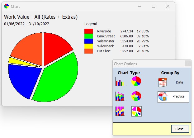
Pressing the chart button at the top of the Reports grid displays a tool window from which you can select how you chart your data. The data can be grouped by date or practice, and displayed in a variety of bar, pie, and doughnut charts.